Brand guidebook design for SME's who need tighter control over their visual identity use
Often businesses and organisations start small, with a logo and a website. But as they grow, multiple people are now working with your brands visual identity in their documents, presentations, advertising and social posts but without a set of brand guidebook guidelines differing fonts and colours are used from one application to the next.
The website uses one headline font, then documents and presentations use another. No one knows the correct colour values for print and digital use and your logo is used on background colours and images where it’s readability is hindered. There’s no cohesive visual style in the photography and iconography used and external partners such as design and advertising companies, each put their own spin on the brand.
All this leads to a visually messy brand identity that looks unprofessional in your audiences eyes and impacts negatively on your brands memorability.
By producing a set of standard brand guidebook guidelines that can be shared with all employees, stakeholders and external partners, you can ensure there is solid alignment around how your brands visual identity should be used.


What our standard brand guidelines cover
If elements from the below don't currently exist within your branding but guidance is required, we will make recommendations.
Logo colour versions usage & incorrect usage
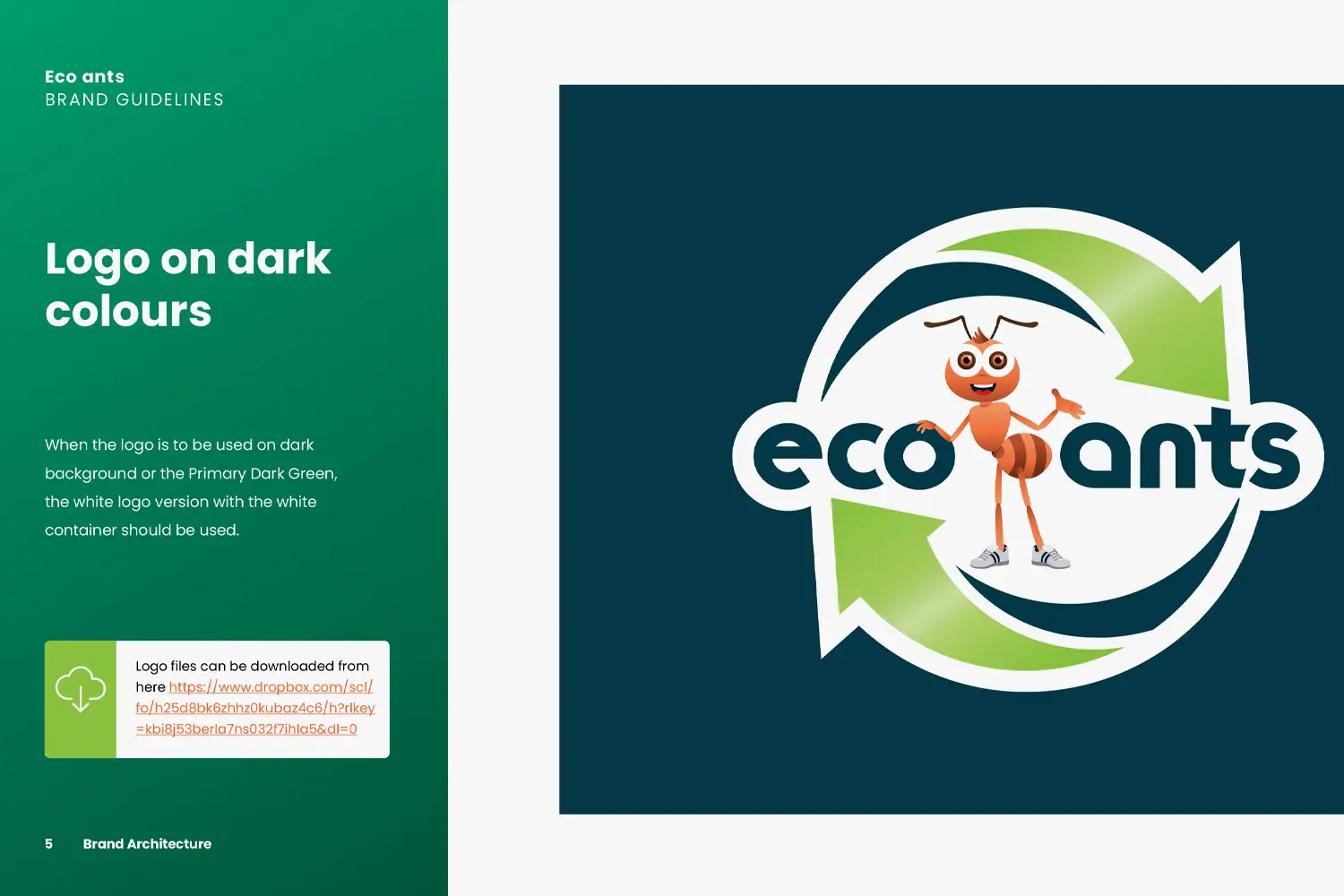
- Specifying how the colour logo should be used on white, dark and non brand background colour
- Examples provided of correct and incorrect usage
- If you have your logo files saved on cloud hosting, we will include a download link in the document
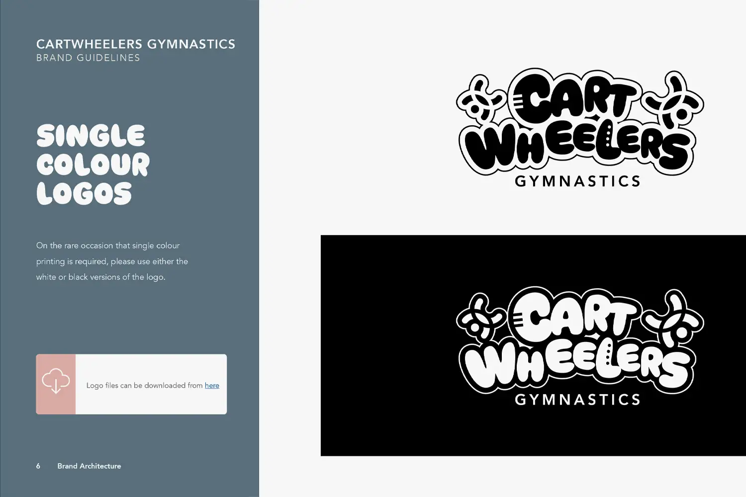
Logo monotone colour usage
- If you have a solid white or black version of your logo, we specify when and why they should be used.
- Examples provided of correct and incorrect usage
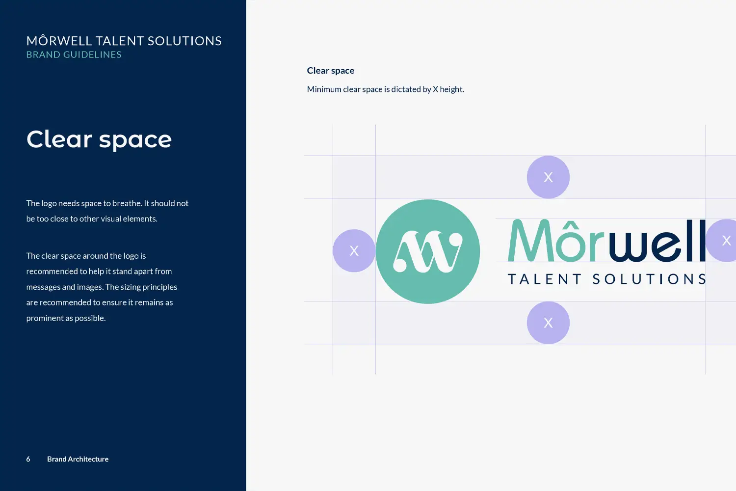
Logo sizing and clear space
- Specifications on the minimal logo sizing for print and digital use.
- Logo clear space settings to ensure the logo is not cluttered when used next to other elements.
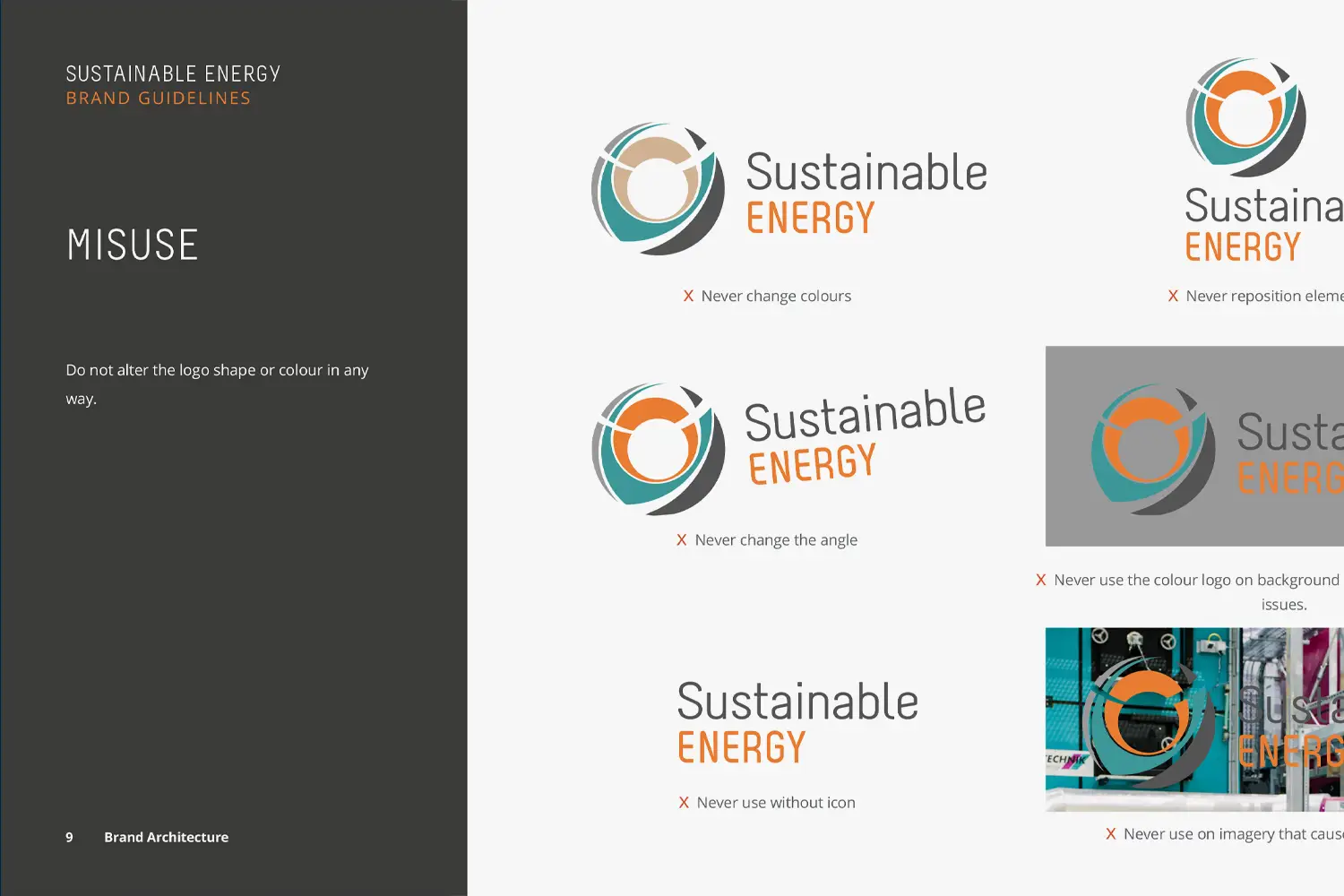
Logo misuse
- To prevent the misuse of the brand logo we provide examples of how the logo should not be used from changing colours, repositioning elements, angling the logo to changing proportions and using on incorrect backgrounds.
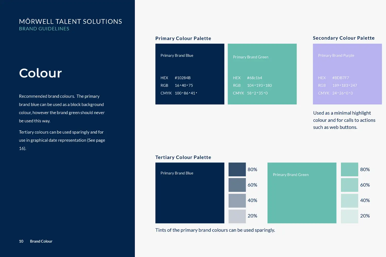
Colour palette settings
- Specifications on then primary colour palette plus secondary and tertiary if applicable.
- Colour values provided for digital use with RGB and HEX colour values.
- Colour values provided for professional print use with CMYK and Pantone colour values.
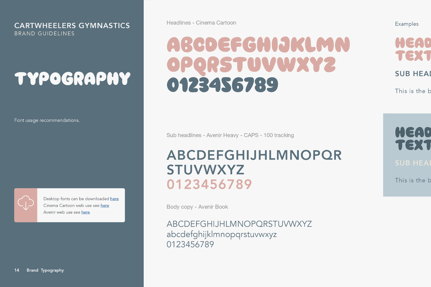
Typography hierarchy and settings
- Specifications the fonts to be used across the hierarchy of fonts (Headline, Sub headline, body copy).
- Fallback system safe font recommendations if required.
- Web link provided to download fonts from font provider (Free or paid).
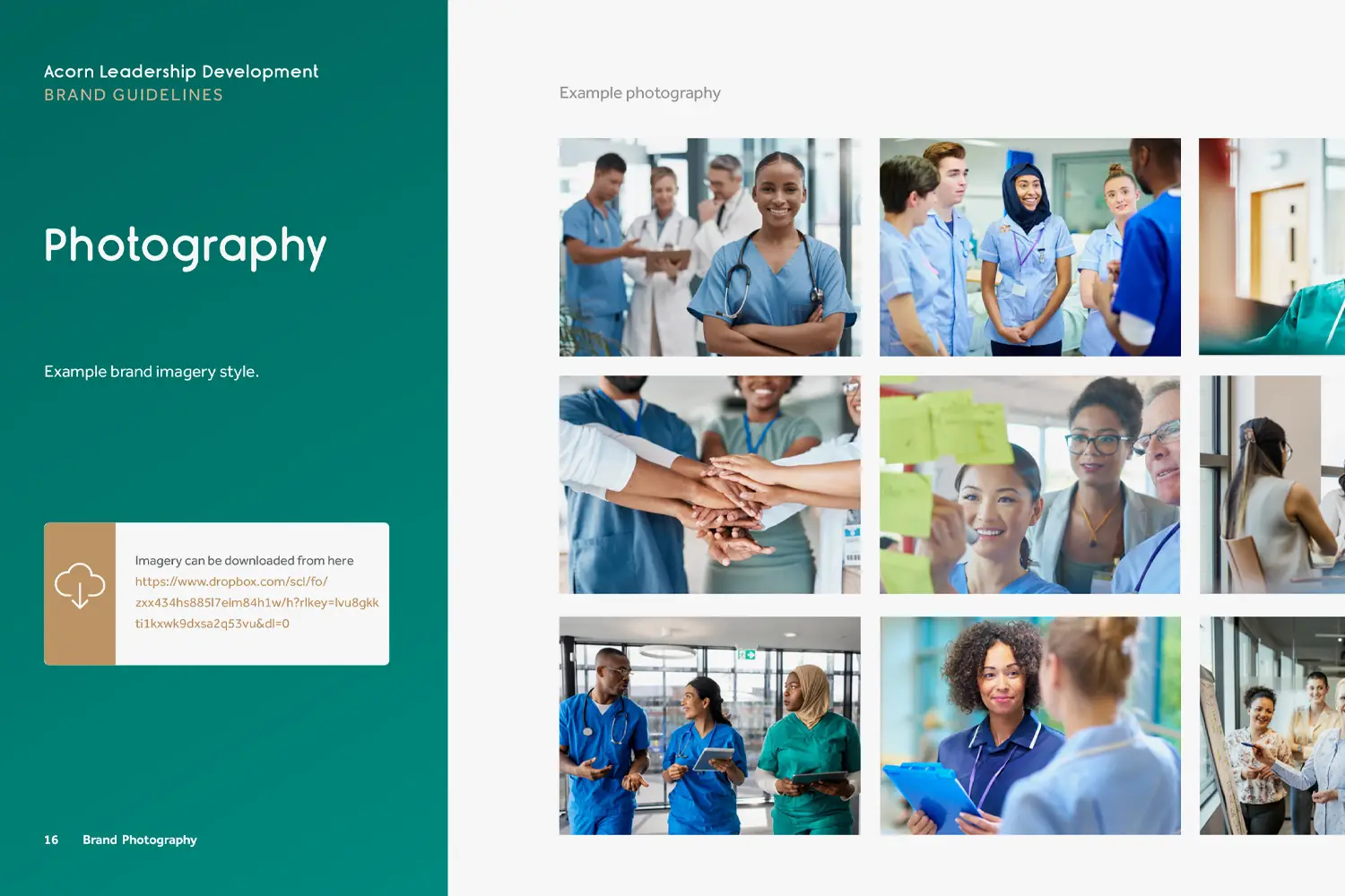
Recommended photography style
- Explanation provided for the brands photography style and tone.
- Example photography shown.
- If you have a bank of brand photography stored on cloud hosting, a web link can be provided to access and download.
- If design style settings need to be be applied to photography, these will be detailed.
- A photography library can be built at an additional cost.
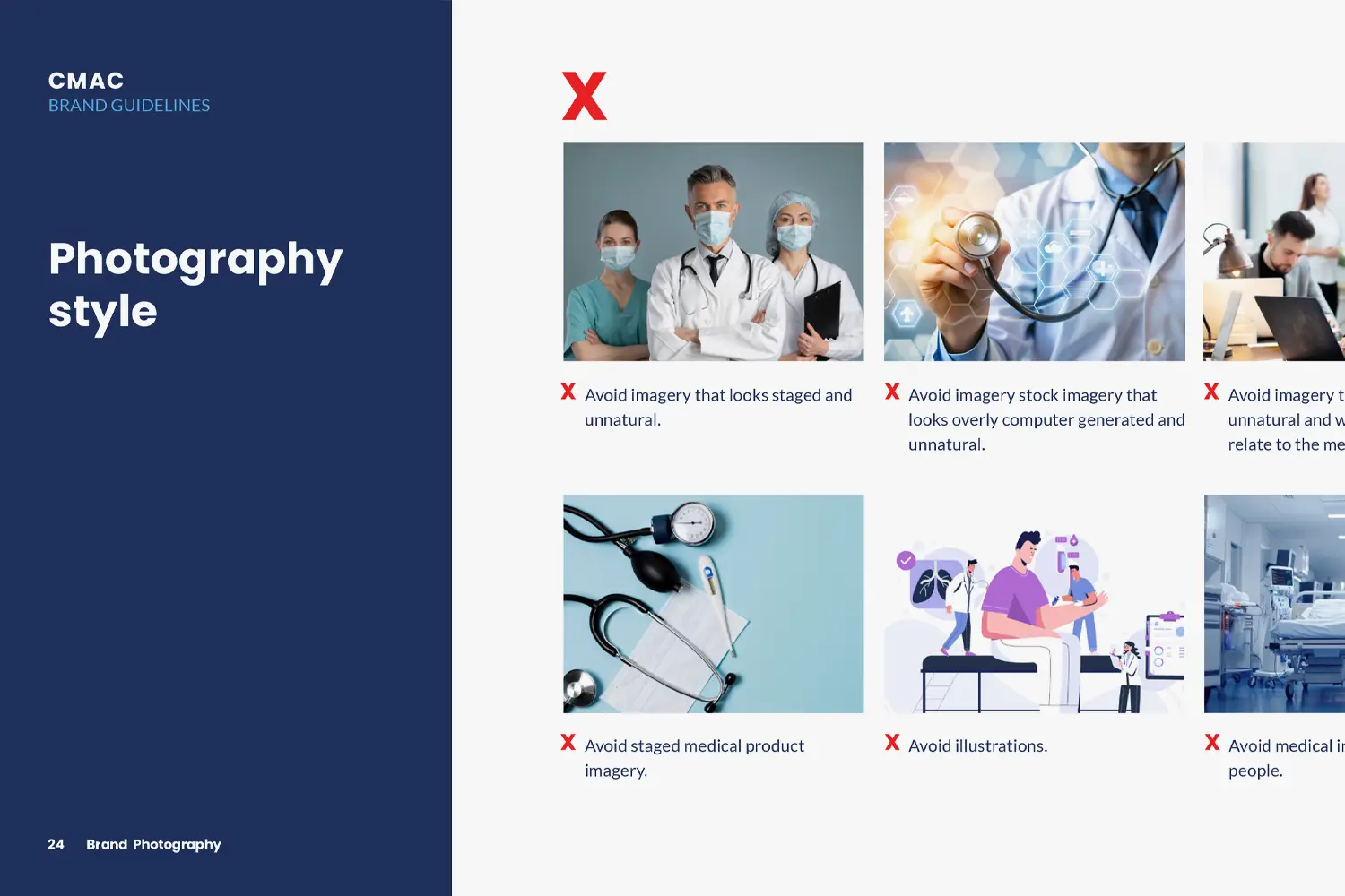
Incorrect photography style
- Explanation on the incorrect style of photography.
- Examples provided of incorrect photography style.
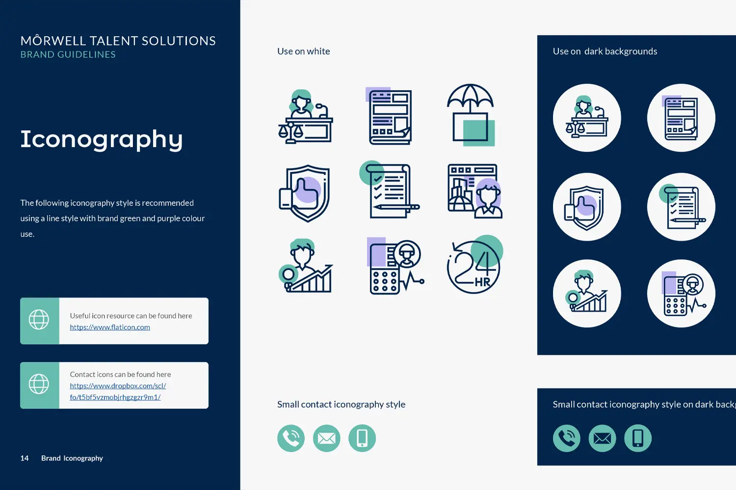
Iconography style
- Example primary icon style shown for use on dark and light backgrounds.
- Small secondary contact icon design detailed.
- If you have an icon library these can be linked to via a web link.
- Web link provided to stock icon website.
- Icon design can be provided at an additional cost.
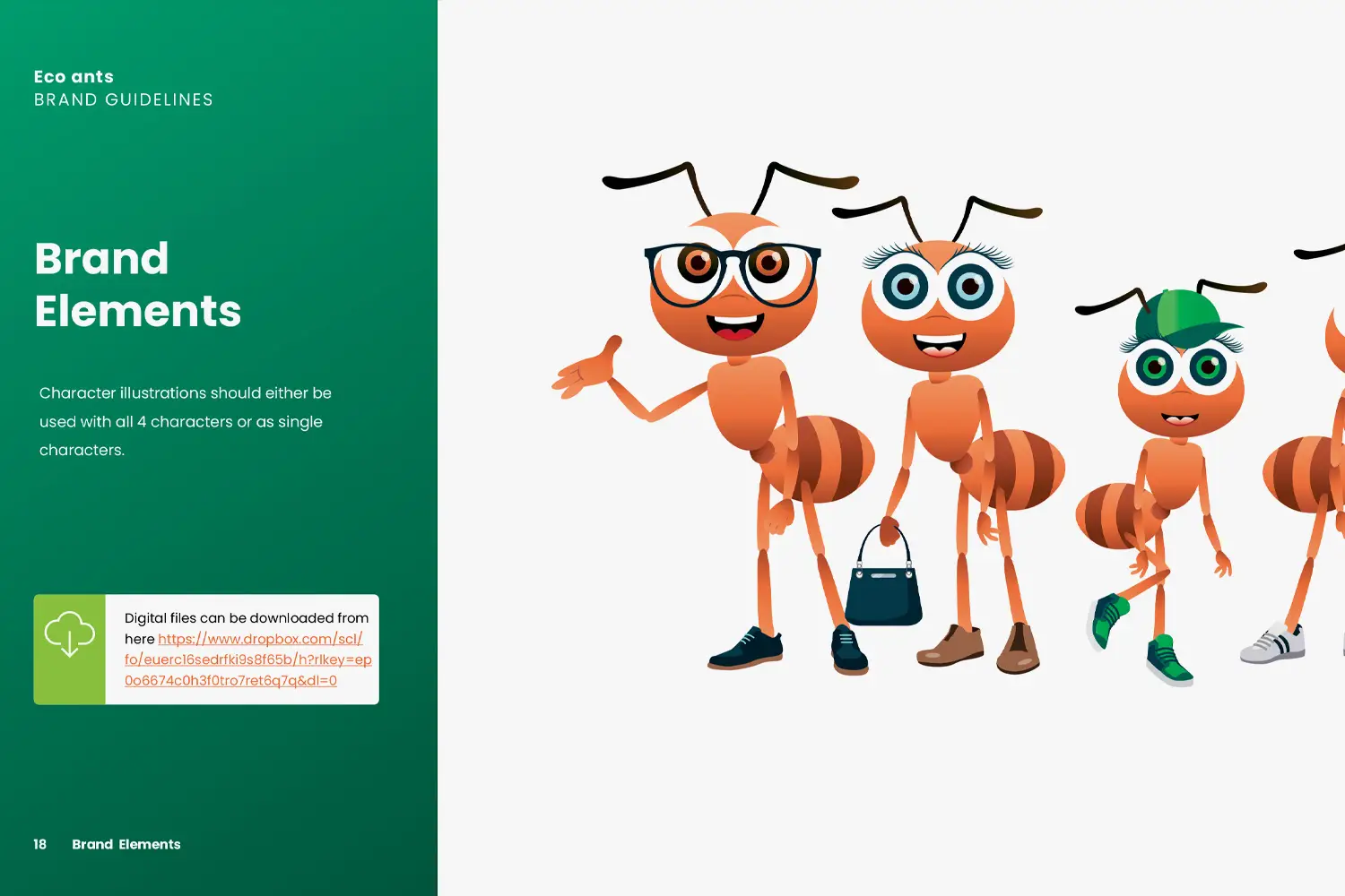
Illustration & pattern style (if required)
- If the brand uses an illustration style, this will be detailed with examples.
- If the brand uses a pattern style, this will be detailed with examples.
- If you have an illustration library this can be linked to via a web link.
- Illustration and pattern design can be provided at an additional cost.
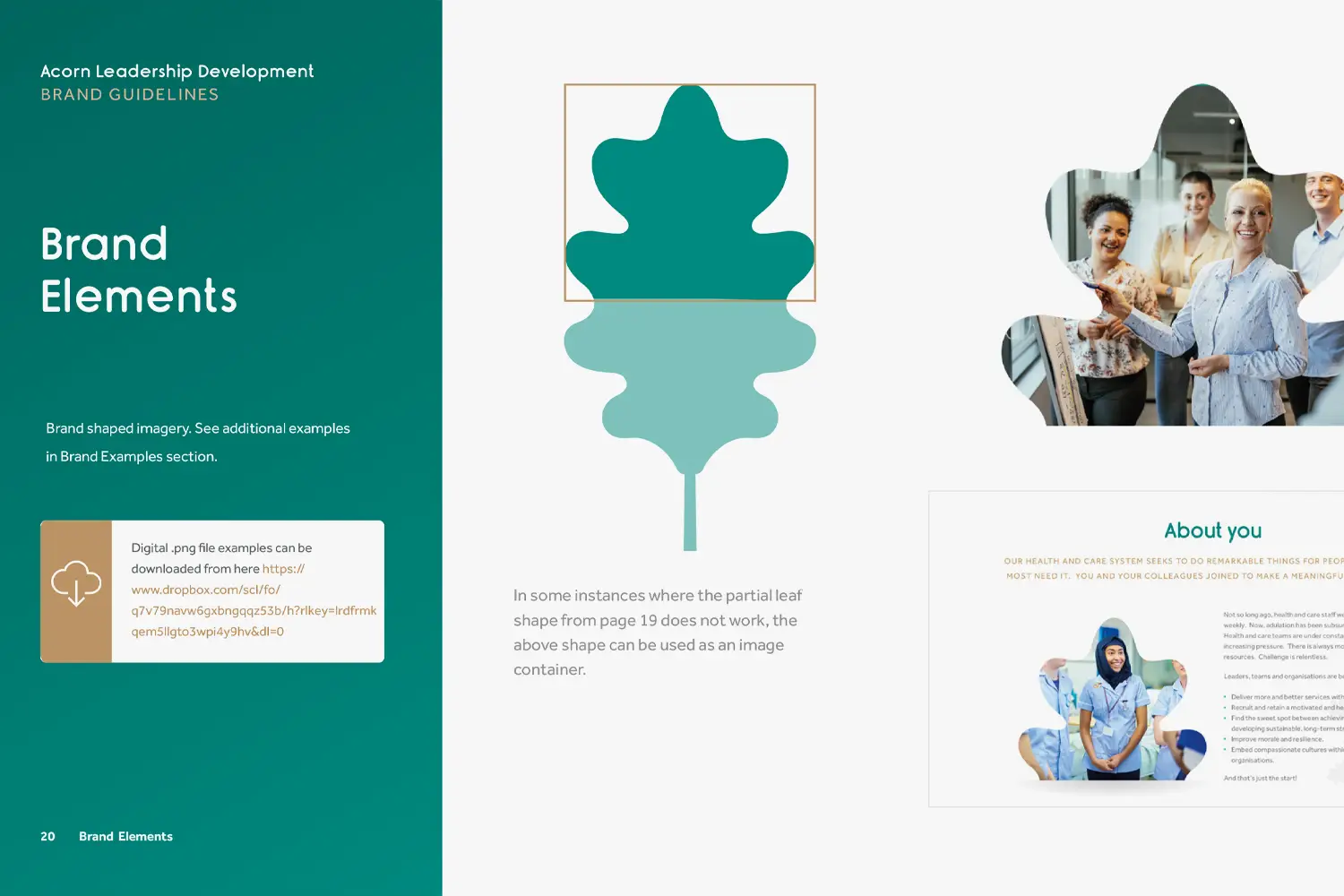
Specific brand element styling direction
- If there are design elements associated with the brand such as blocks, shapes, swishes etc. these will be detailed along with usage recommendations.
- Additional elements to increase the brand distinctiveness can be designed at an additional cost.
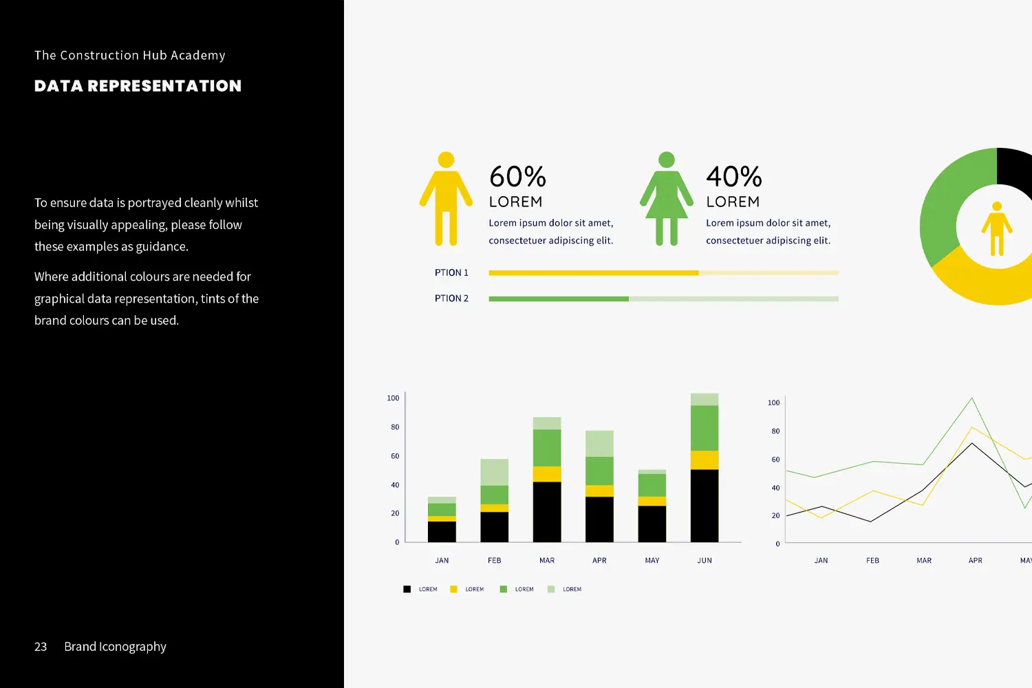
Table, graph, data & quote styling
- Examples shown for how graphical information should be displayed.
- Table design styling recommendations.
- Key stat and data display recommendations
- Testimonial/quote styling recommendations.

Brand examples (up to 5)
- Up to 5 brand example images included. This does not include design.
- Examples allow reader to see and understand the brand in use.
Final brand guidebook supplied as a digital PDF file

Pricing
Standard
We review your website and existing branding to develop your guidelines- Logo usage & incorrect usage
- Logo sizing and clear space
- Logo colour and monotone usage
- Colour palette - print & digital colour values
- Typography hierarchy and settings
- Recommended photography style
- Incorrect photography style
- Iconography style
- Illustration & pattern style (if required)
- Specific brand element styling direction
- Table, graph & data styling
- Brand examples (up to 5)
- Provided as a digital PDF document

Take control & align your brand's visual identity
Contact us to discuss how we can help build your brand guidelines today.